Sign up for our free daily newsletter
Get the latest news and some fun stuff
in your inbox every day
Get the latest news and some fun stuff
in your inbox every day
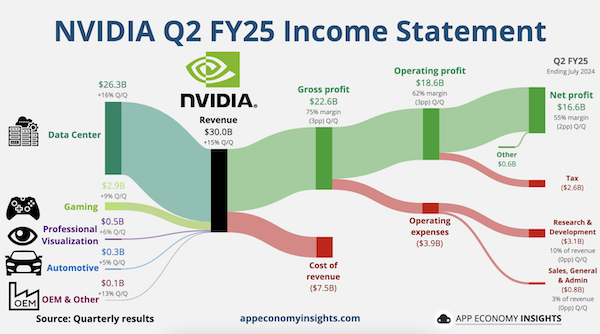
A Sankey diagram is a visualisation used to depict a flow from one set of values to another. They are often used to depict the financial results of large companies. By showing revenues on the left, costs in red falling out the bottom and resulting profits in green on the right, you can quite easily see how a business is doing.
Consider the delicious chart of Nvidia's recent quarterly results below. That big green profit tube is an absolute unit. It looks like a giant vegetable!
To echo Michael's comments above, the major observations are as follows. (1) Most of the revenues come from the data centre business, and everything else is very small, other than gaming. (2) Expense items like cost of revenue, operating expenses and tax are pretty trivial. (3) Net profit is huge, at a gross margin of 55%.
We recommend that investors hold on to the Nvidia shares that they own already.. Those who don't own them, can buy them at current levels.